
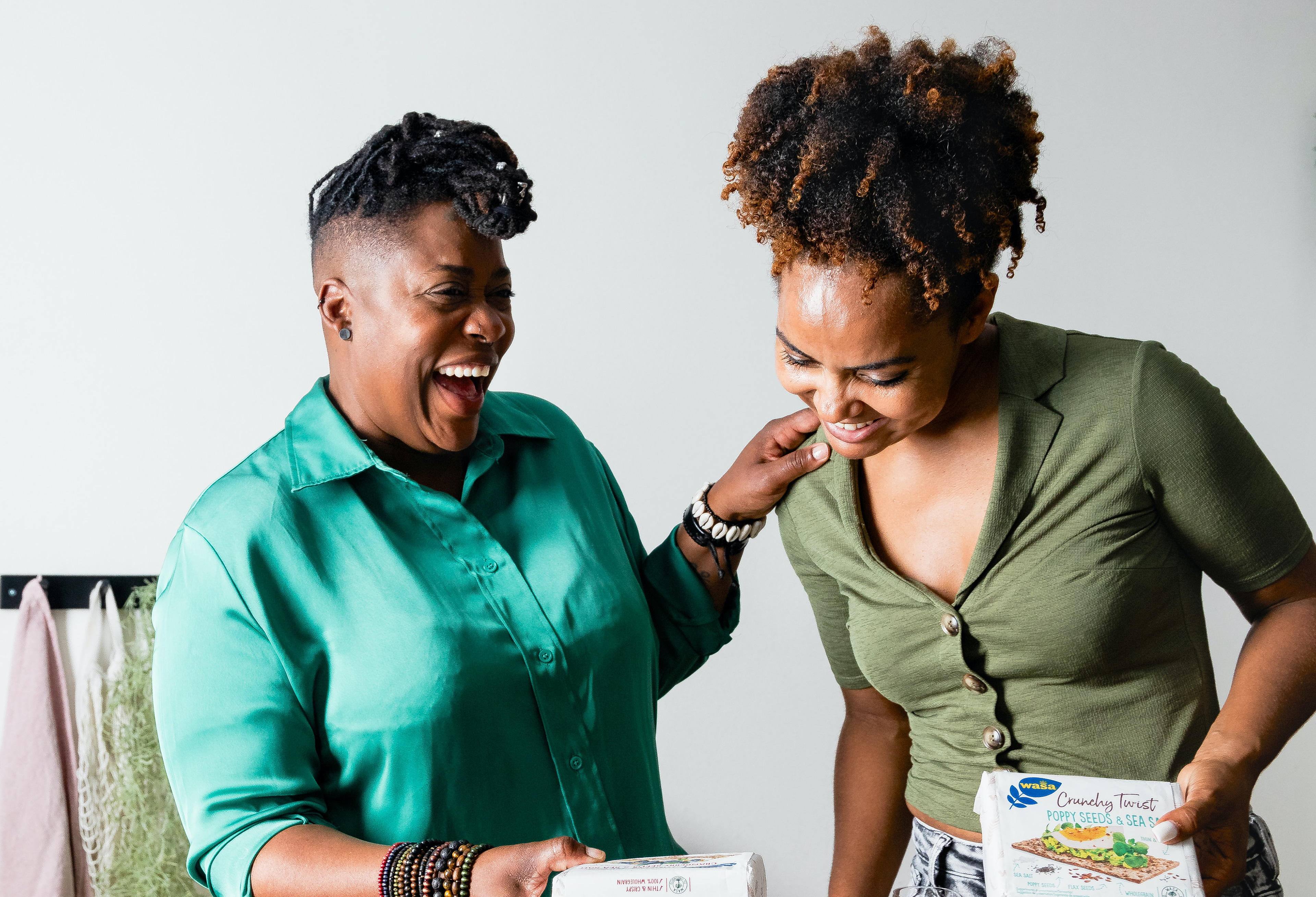
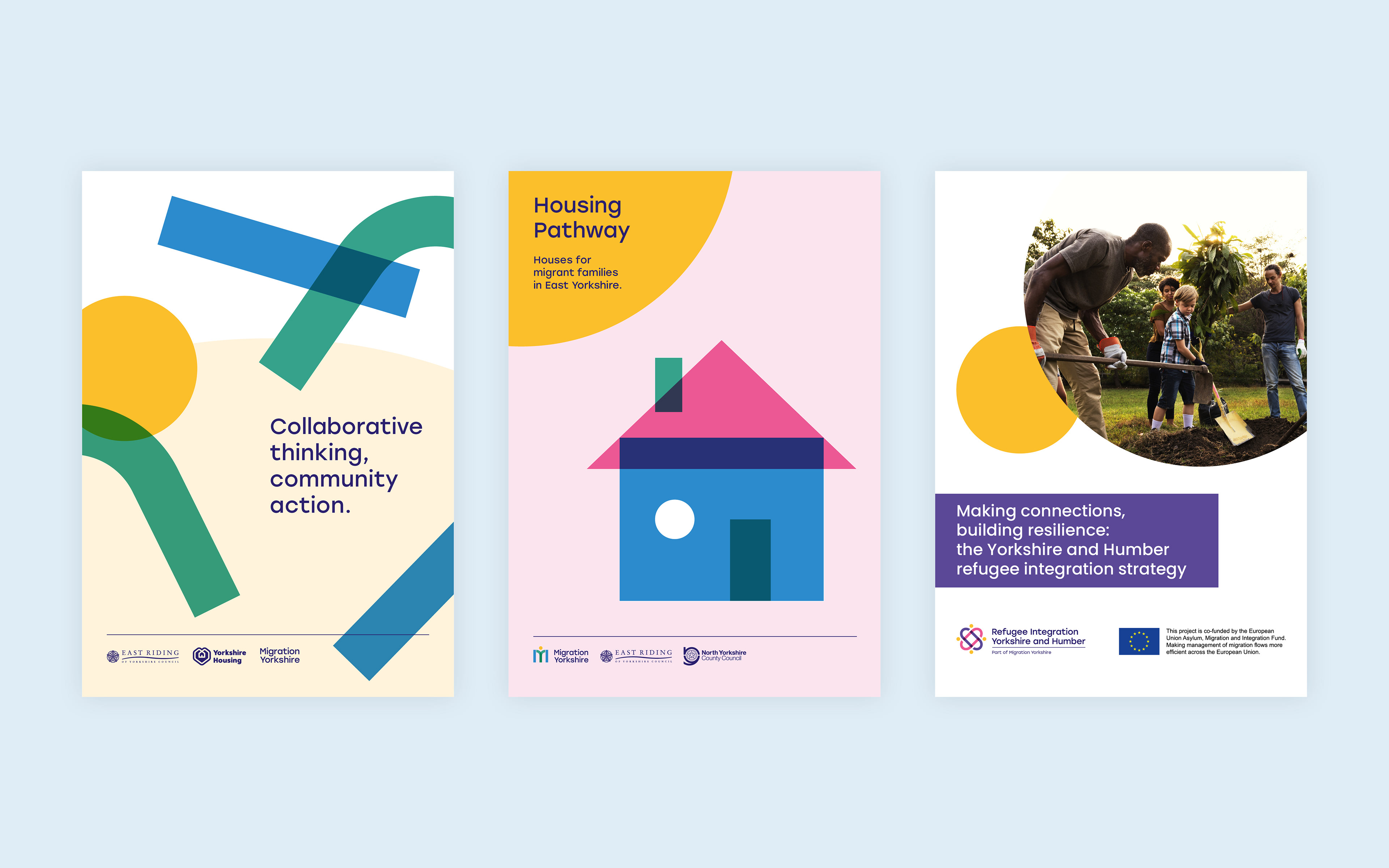
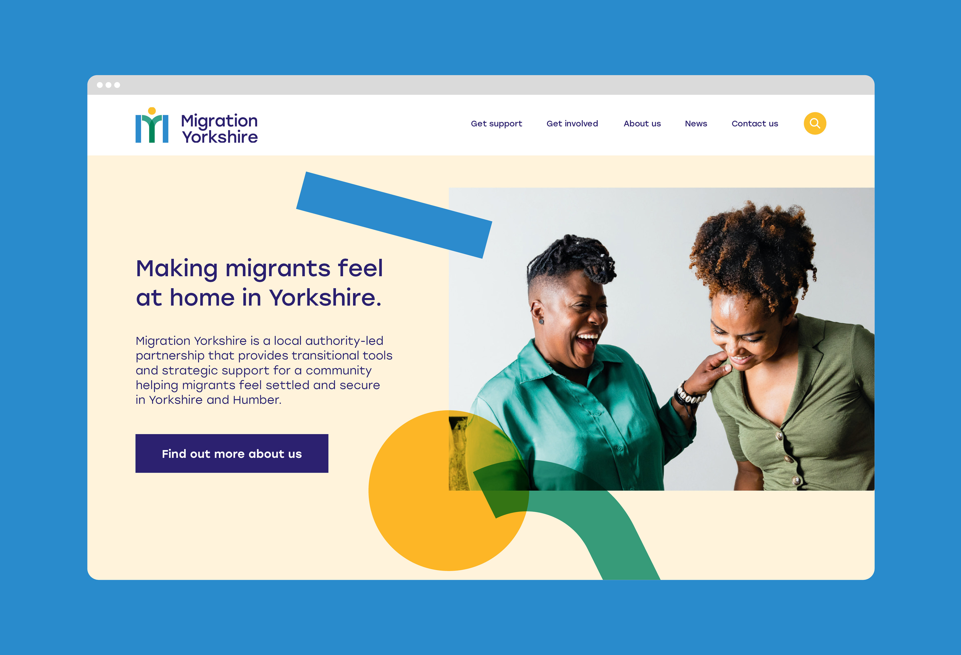
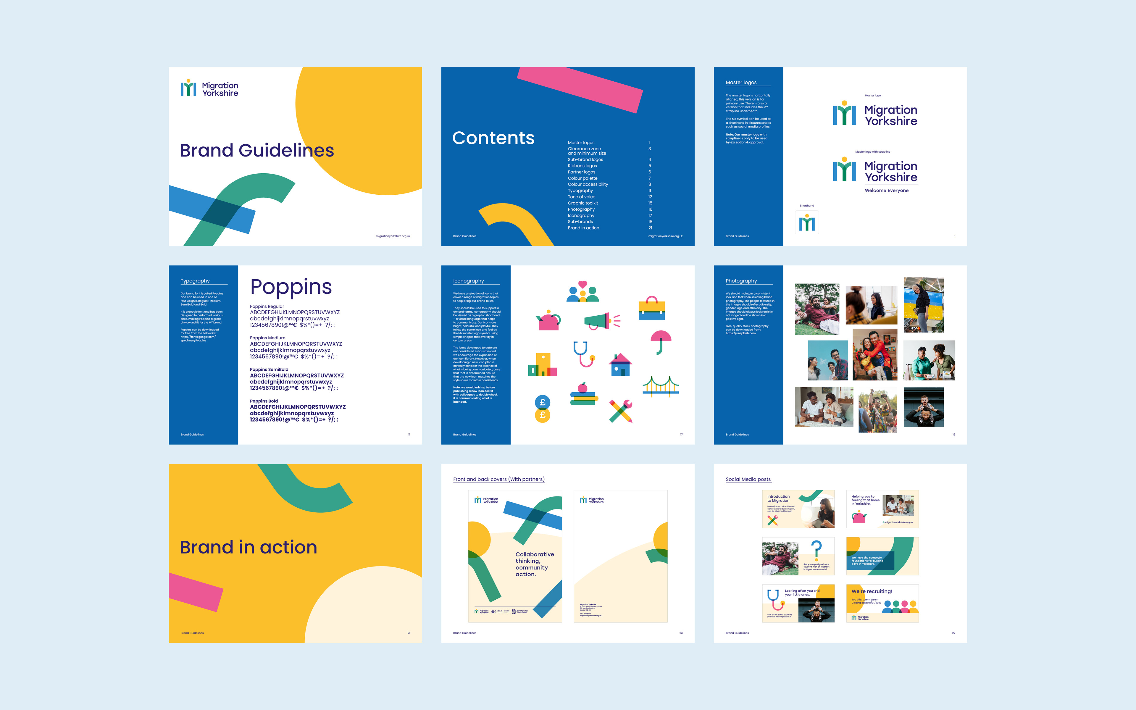
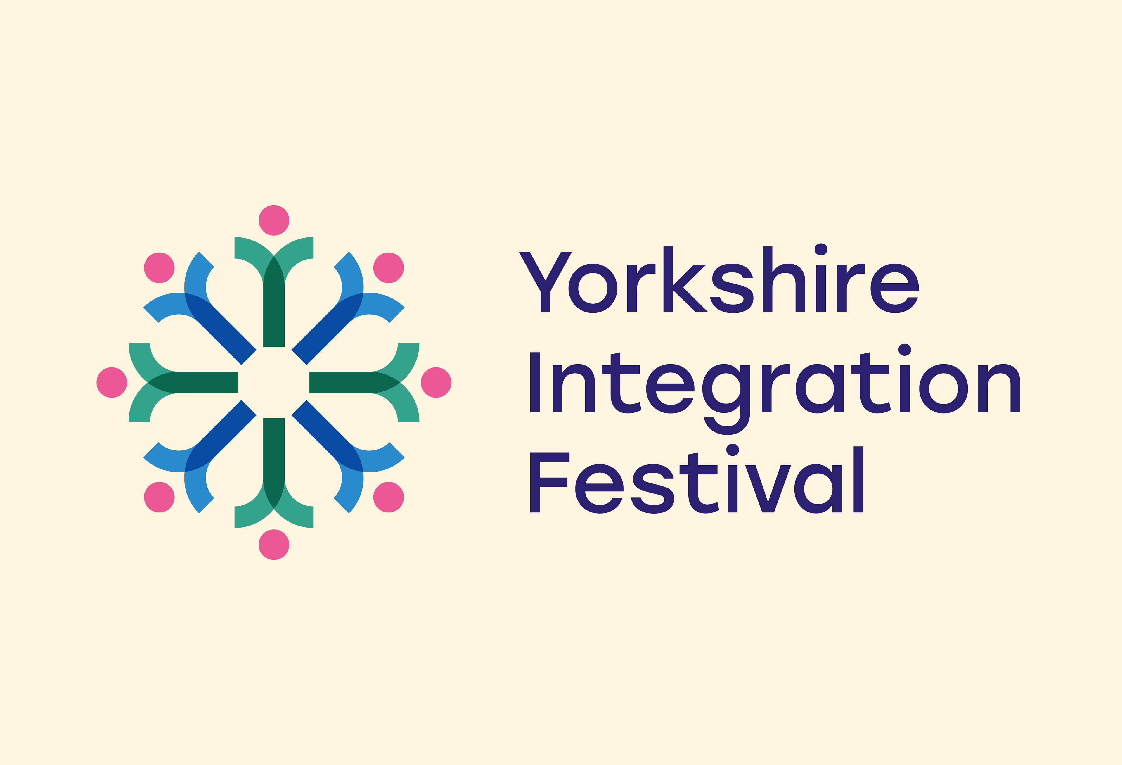
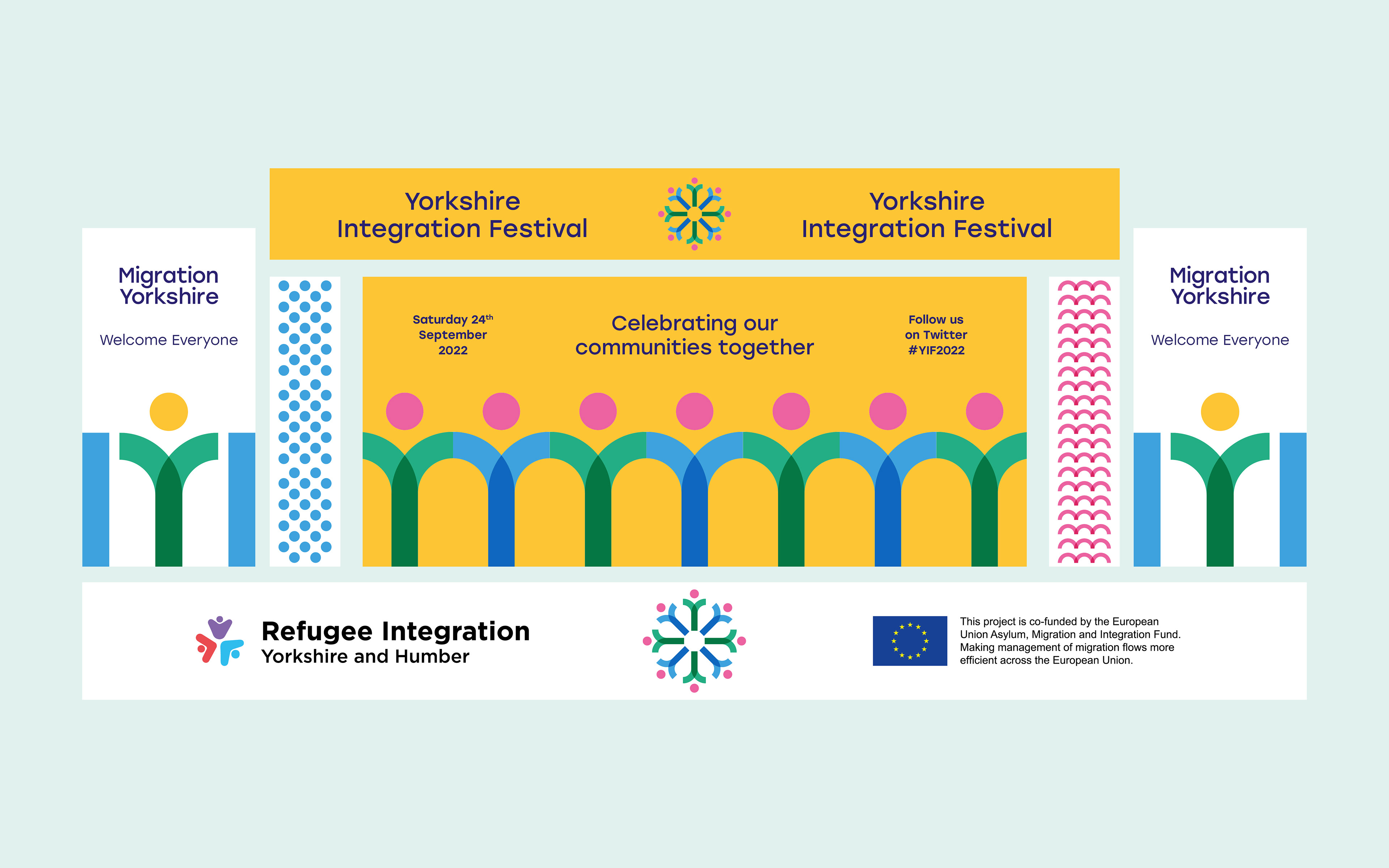
Migration Yorkshire place migrants at the centre of all that they do. By exploiting the serendipity of the letterform (an M and a Y), a visual metaphor is created that represents people being placed at the core.
The outcome is a bright and optimistic brand with the ability to deconstruct the symbol and shapes to create a flexible, dynamic and playful brand toolkit.


Yorkshire Integration Festival branding
Designed at Glorious Creative.