
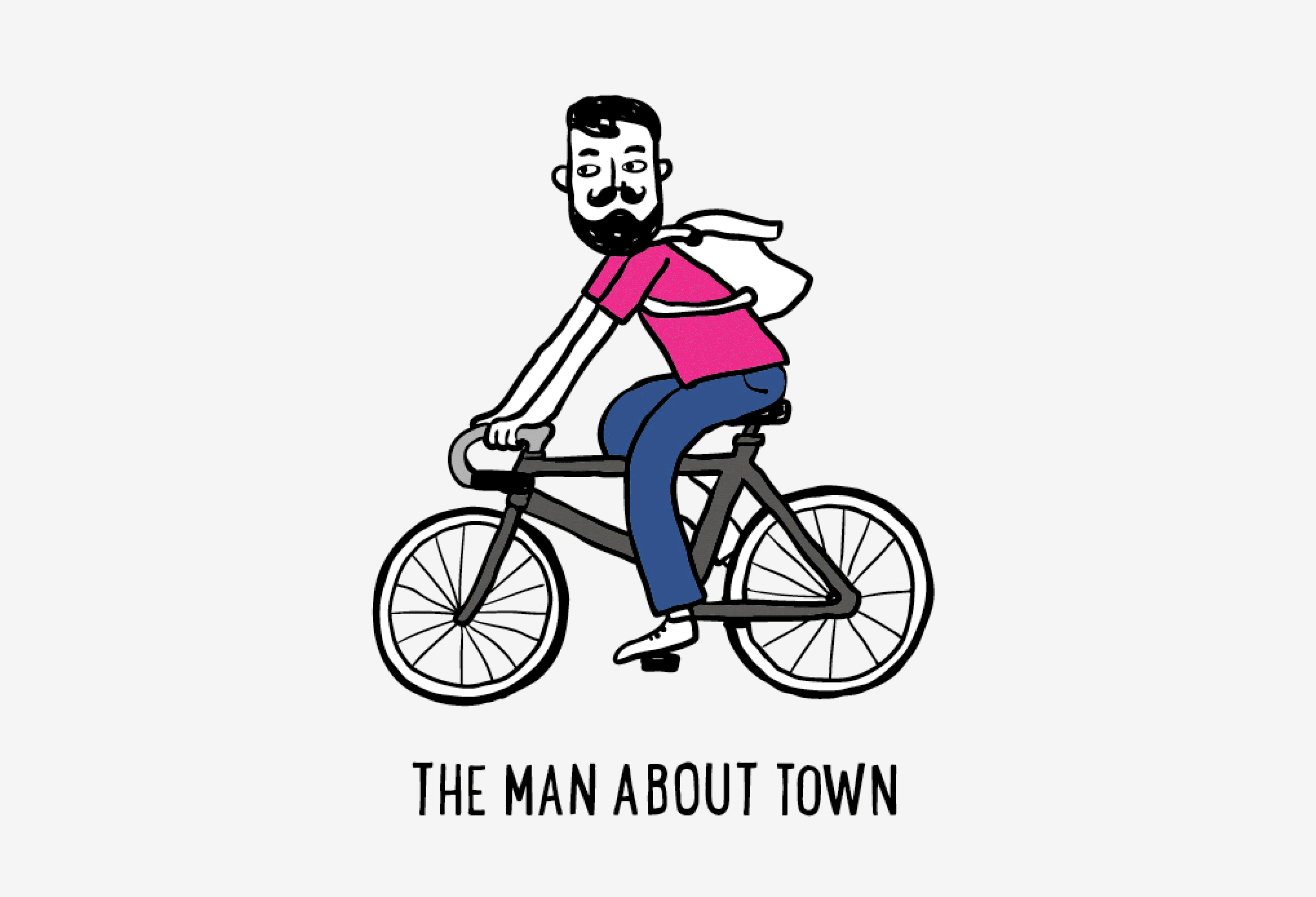
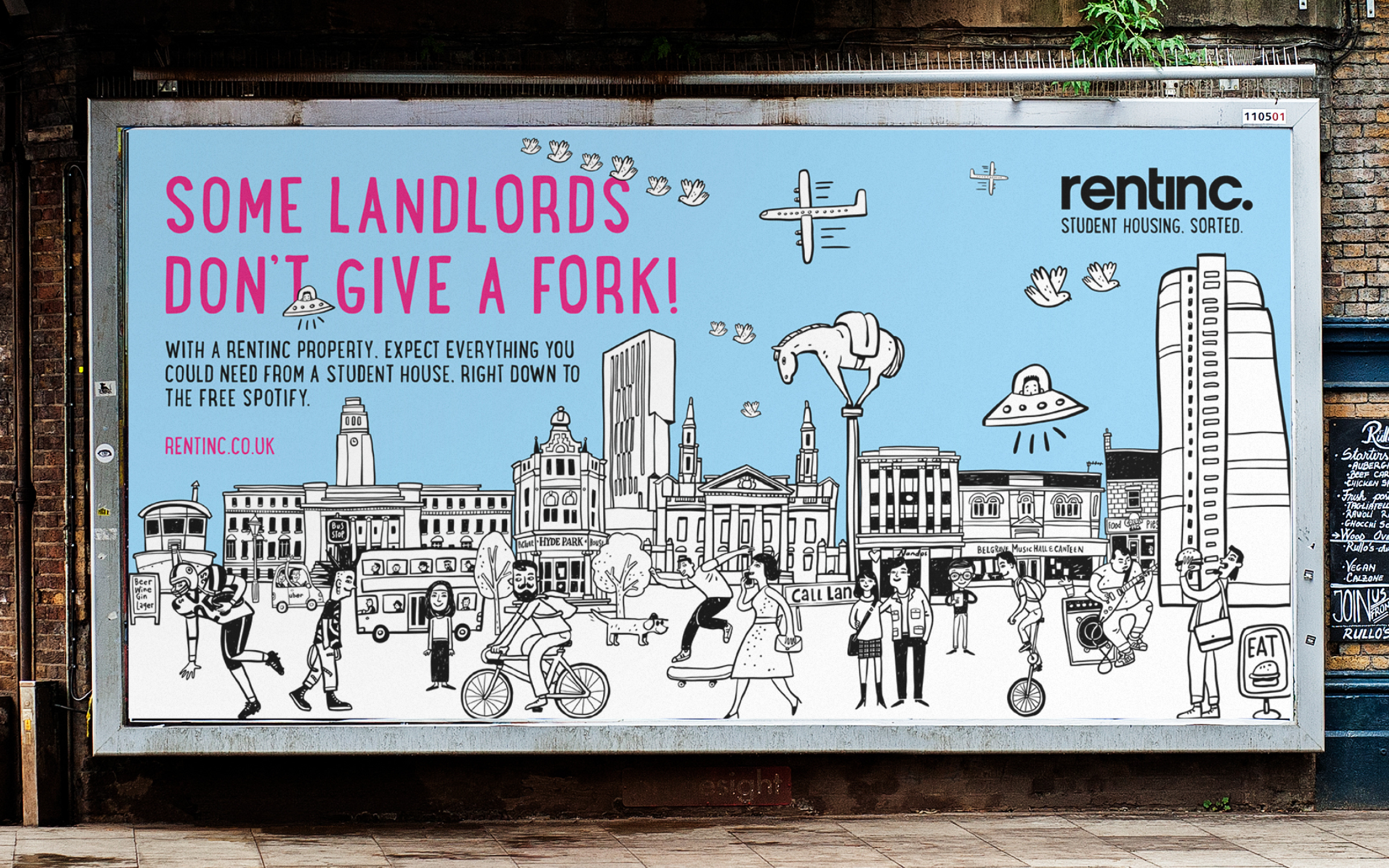
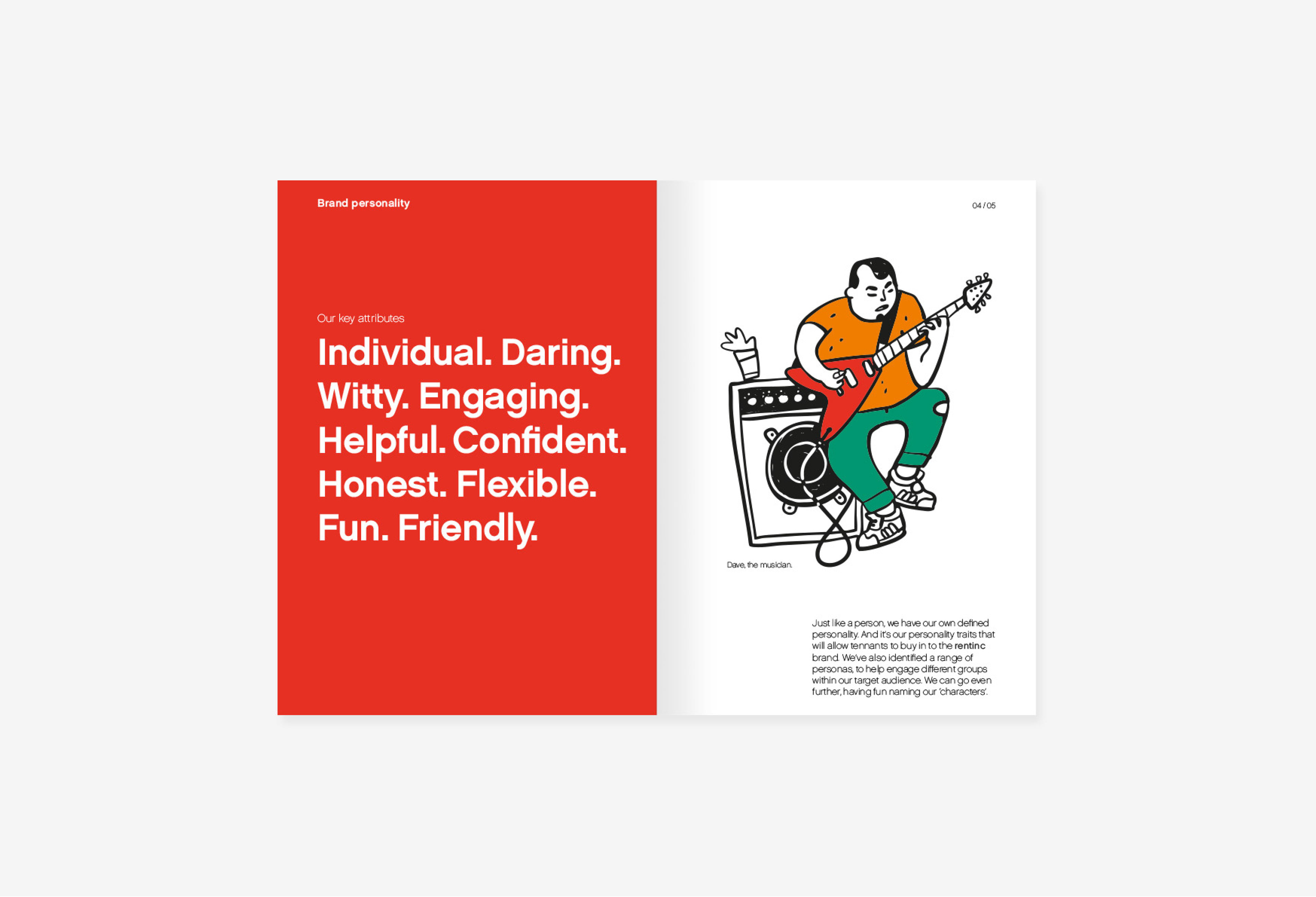
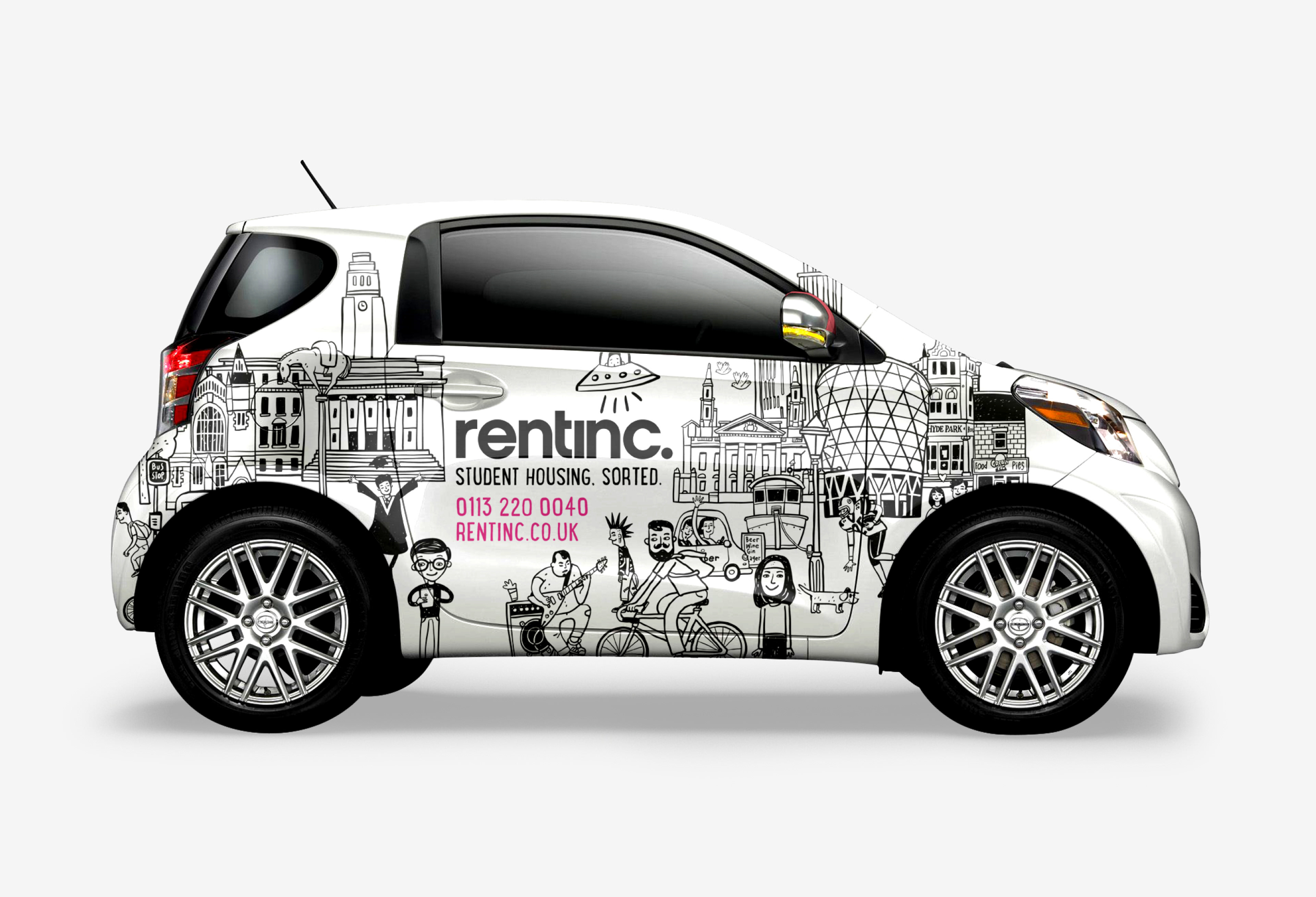
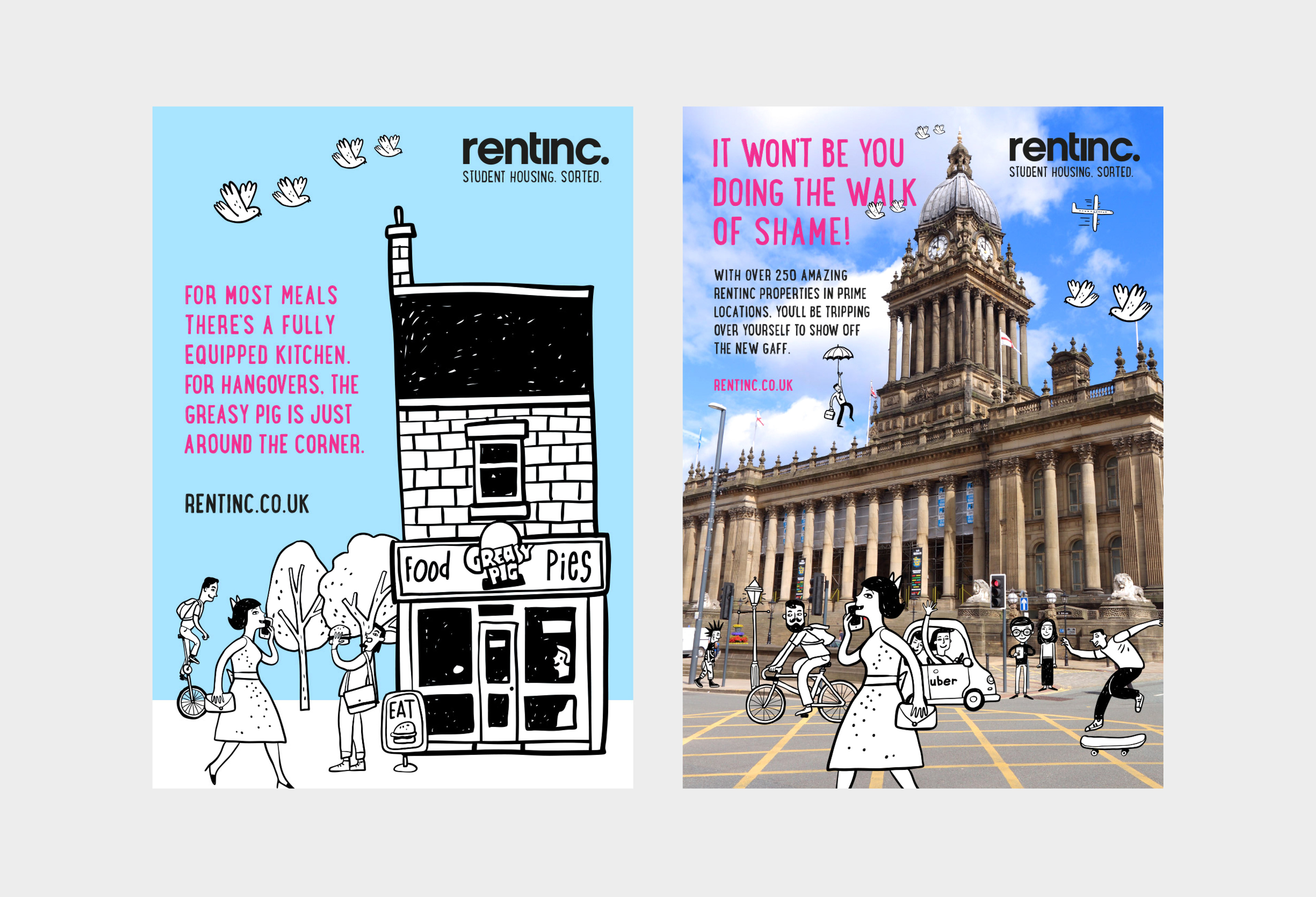
Repositioning Rentinc as the experts in the student accommodation market. The new look and feel adopted an ‘edgy’ tone of voice, a distinctive illustrative style creating a more youthful brand. The client insisted that the existing brand mark had to stay but a new strapline was introduced identifying Rentinc as the student accommodation specialists.


Designed at Glorious Creative.